
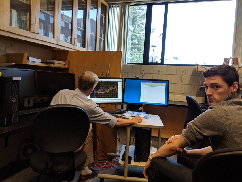
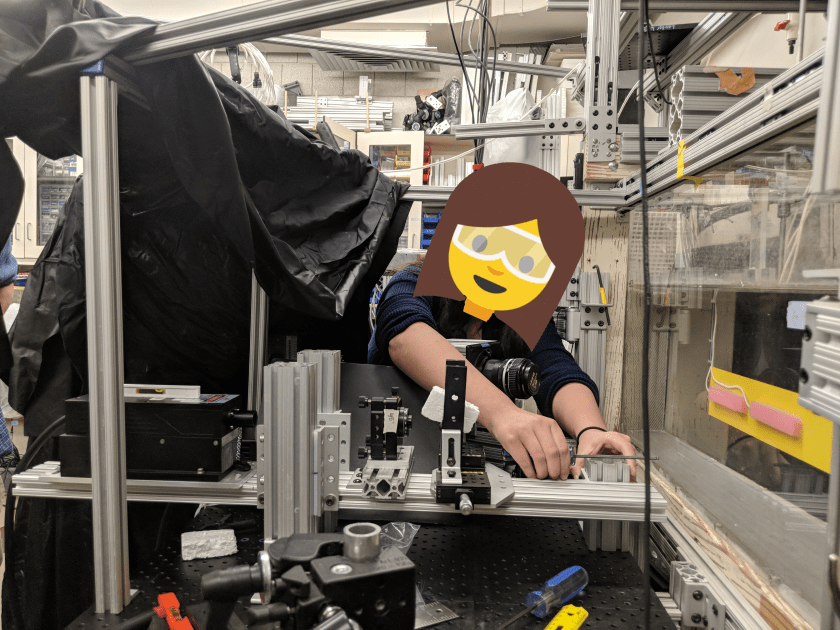
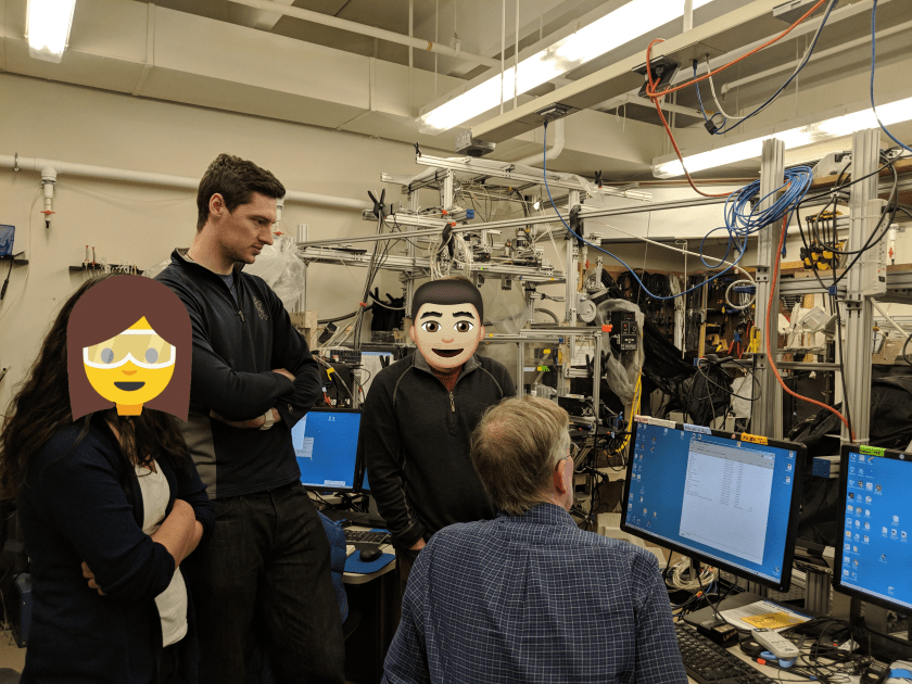
It’s taken a year and a half to begin experiments using PIV, but we’ve finally learned how to use it. George taught me, Dave, an engineering dude, and my biomechanics lab partner how to set up and analyze Particle Image Velocimetry in experiments.
I’ve talked about PIV before in my OceanBots blog, but it definitely deserves its own blog post. PIV is an amazing technology, and it has probably revolutionized how we do fluid experiments.
Before I get into the nitty gritty of how it works, though, let’s take a step back and learn some fluid dynamics. If you’re scared of fluid dynamics (I know I was before I started learning it – people traumatized me with tales of horribly complicated, unsolvable Navier-Stokes equations and I was just like, ‘heh, no thank you’), please keep reading.
This stuff is actually really cool, and I’m going to do my best to present it in a way that will hopefully make sense to everyone, no matter your background. But definitely let me know if I don’t, so I know what I can improve on.
Types of Flow
It all starts with the basic question: how do you know what a fluid is doing around an object?
There are two main types of flow: steady and unsteady. The technical words for these states are ‘laminar’ and ‘turbulent’. To get at what these means, we need to set up a way to think about fluids (any gas or liquid).
Imagine a volume of flowing liquid. It doesn’t matter how large or small it is, just that there are no walls to worry about. Now, the fluid is comprised of nothing but particles, which have vectors (direction and speed).

As the particles move, they follow a path, so it is possible to divide this volume of flowing fluid into tons and tons of paths tracing the movement of each particle. These pathways are known as streamlines, and the concept of these streamlines is what we use to define fluid movement, and to ultimately visualize fluid movement.
Laminar, or steady, fluid is when streamlines occur in layers, with no disruptions. The distance between the layers may vary and the layers may have differing velocity, but there is no mixing. Turbulent, or unsteady flow, is when streamlines are, well, unsteady or chaotic. Merging, breaking, and sometimes even backwards flow, which can create vortices. When running experiments, we normally assume – or create – conditions starting with laminar flow.

Let’s put an object into our volume of flow – a sphere. Rather than break the streamlines, the streamlines closest to the object will be diverted around the object and then reconvene on the other side.

But this isn’t always the case. The situation above is “ideal flow”, with no turbulence and no resistance of movement where the fluid meets the sphere. You can change the state of flow from laminar to turbulent by changing a few characterisitcs. These characters and the state of flow are related through a parameter scientists call Reynold’s Number (Re).
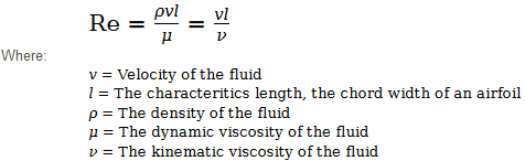
Without going into too much detail, low values of Re represent a more laminar flow. The higher the number, the more likely the flow is to be turbulent. Re depends on the velocity of flow (v), the density of the fluid (rho), length of the object (“characertistic length”, L), and viscosity (mu). You can think of viscosity as the resistance of fluid to movement. Liquid water has a low viscosity. It’s going to flow flow flow. Honey, especially cold honey, however, would rather stay where it is. It has a high viscosity.
(Side note: The Viscosity of Honey by Jay Ingram is a fun, short book and I highly recommend it for reading about some scientific topics in everyday life [e.g. how do stones skip on water?]).
If you have a laminar flow that also lacks viscosity, it is inviscid, an “inviscid flow” situation. The math becomes simple, because there is no friction or resistance to movement, and there are no vortices or shedding to worry about. It is the ideal case. But when is life ever actually ideal?
Reynold’s number can be calculated and we can get an idea of what to expect when we put an object into flow–whether it’ll be mostly laminar or very turbulent.

Why do you care about streamlines, though, and whether the flow is laminar or turbulent?
Think conservation of energy. When the fluid hits the object, some energy is imparted from the moving object to the fluid arround it, and vice versa. In ideal flow, there is no net energy transfer between the object and the fluid. In the case of vortex shedding, because some fluid is coming back around and moving in the opposite direction of surround flow (and in the direction of the moving object), it can sometimes add energy back to the object. This reduces the total energy loss of the system. When you have a completely turbulent system, however, there are no more bound vortices or vortex shedding. It’s just chaos and no energy is returned to the object–making it overall less efficient.
And this is when we get to the idea of streamlining – that is, to make things longer and more pointed at the end, like footballs, tunas, and boats.
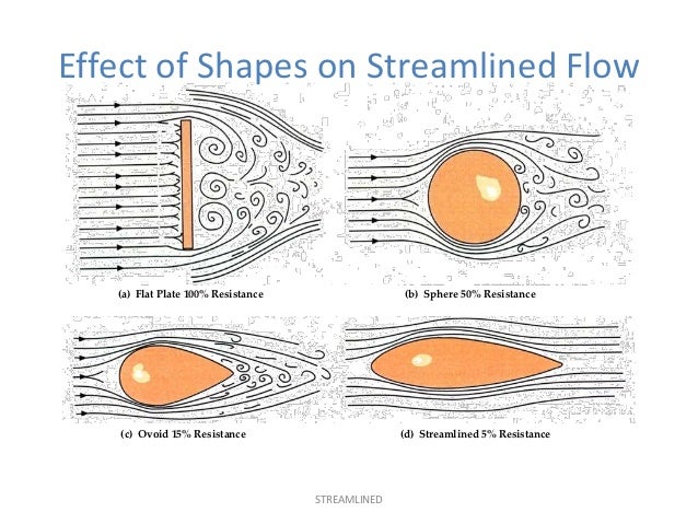
The more streamlined an object, the greater the tapering on the backside, the more the object is able to delay the separation of flow, reducing the strength of the vortices and thus the energy loss to the fluid. This is why most (but not all) fish are torpedo-shaped (or why torpedos are fish-shaped). Shape matters and reducing the amount of energy you need to move through a fluid (be it air or water), especially if you are moving quickly, is paramount.
If we can visualize the fluid streamlines, we can get a lot of information about how an object in flow is interacting with the surrounding fluid.
Flow Visualization Methods
People have invented a lot of different methods to visualize flow, and there is a lot of science behind each of them, which I’m not really planning on going into too much.
One way to visualize flow in is to rely on differential refractive indices–or to capitalize on differing density. Have you ever looked at the shadow of waves on the bottom of a pool? Or held a candle next to a wall and to see the smoke in the shadow? You’ve capitalized on the refractive index differences between air and smoke to visualize how the smoke is moving in relation to the surrounding air!

This is called Schlieren optics (or photography) and it’s very cool. It was invented by August Toepler in 1864, or so says Wikipedia. Here’s that example of visualizing smoke from a candle.

This video is from Harvard Natural Sciences Lecture Demonstration’s Youtube channel and shows quite a few examples using Schlieren optics. Definitely worth the 2-minute watch (though I’m sorry there’s no music with it).
Schlieren optics was actually my first introduction to flow visualization, in Jeannette Yen’s lab. I wasn’t quite aware of what it was or why it was important at the time–or how I would come back to it in a very roundabout way five years later.
Another way to visualize flow in air is to actually add something to the air to make it visible to the naked eye. Like smoke. If you watch commercials on TV, then chances are good you’ve seen a car commercial use a clip that looks like this:

Here, smoke streamlines have been introduced to the flow chamber. This is also how studies are done on airplane wings (and other airfoils like bird/insect wings).

This technique can be adapted for use in liquid flows, using dye streams.

And it has also been used in fish and flapper studies. In the video below, orange dye on top and green dye on the bottom is used to visualize the creation of von Karmann wakes by a flapping foil.
But what about visualizing the entire fluid volume, and not just streams?
Particle Image Velocimetry
And now we finally arrive at the technique of particle image velocimetry. Rather than try to visualize large swatched of streamlines–leaving large information gaps where there are no dyes or smokes, what if we were able to visualize the paths of individual particles?
That’s what PIV is, in a nutshell. Adding particles to fluid to visualize how the flow is moving. Simple enough, right?
The types of particles you use matter. Neutrally buoyant particles won’t float to the surface or sink to the bottom of the fluid volume, but will stay in the flow streamlines. And they need to be neutrally buoyant for your specific fluid.
And this can be done both in liquids and in air. For air, scientists use soap bubbles!

After the particles are introduced to the fluid, we can visualize the particles by lighting them up with a laser. They will reflect the light and the fluid around them, which lack particles, will stay dark. It’s actually important to get a good ratio of light to dark. If you oversaturate the liquid with particles, then you’ll basically end up with just a large white sheet, and if you undersaturate, then you might not be able to see enough detail in the flow.
And after everything is set up, the experiments can begin!
The cool part of PIV, in my opinion, is the analysis.
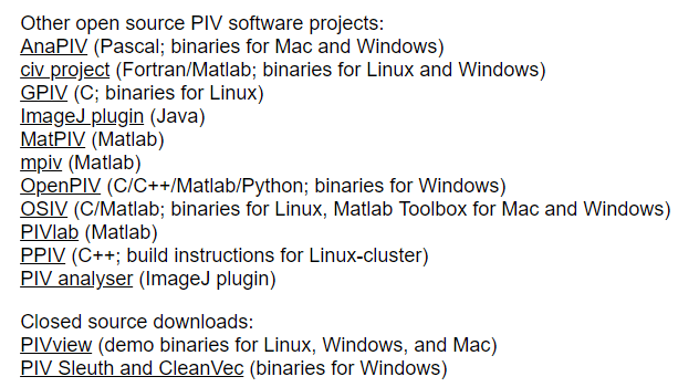
The software to analyze PIV data is probably the biggest complication. Particles can be easily purchased, lasers need to be set up but are an otherwise relatively easy step. The software, however, is where things get tricky. A DaVis license from LaVision, the leading PIV software developer, is going to cost you several thousands of dollars. However, they are the leading option for a reason. There are open-source options, but like anything that is open-source, there will be limitations not present in the licensed version. The most immediate issue I see, for example, is that the latest blog on OpenPIV’s site is from 2016 and says that OpenPIV works on Windows 8.1.
But there are so many options.
I have only ever used DaVis, though, so I can’t compare and contrast any of these for you, unfortunately. If you have experience with these softwares, please leave a comment telling us what you think!
But once you start analyzing, DaVis has so many options, buttons, and tricks to visualize the flow, and it’s fun! Confusing and frustrating at times, the same as with coding, but ultimately rewarding when you finally get a beautiful, finished video.
Here are some cool ones.
PIV was first invented at the beginning of the 20th century, but it didn’t become a mainstream technology until the 1980s or 1990s, and based on the literature I’ve seen, it has only taken off in popularity and accessibility in the last two decades or so. Now, it’s one of the go-to methods for visualizing flow.
I’m attending and presenting at a fluid dynamics conference in November. I’m guessing that of the presentations showing experimental data (not computational or theoretical), more than 80% will use/show PIV videos. I’ll let you know the final tally after that conference.
And so that is PIV.
Dave and I chose PIV class projects specifically because it would help further our own research skills and the projects themselves tied into our individual research projects. I think this was the first time I’ve ever been able to do that, actually–use a class project to further a research project. I’ve certainly based a research project on a class project before, but this is a new level of double-dipping. Graduate level double-dipping. I like it.

George taught us how to align the lasers and mirrors. We had one in front of the tank and one in the back of the tank, and this way we could see both sides of the pneufish, rather than just the side closest to laser–the other side would have been in shadow.
We learned PIV back during the spring semester, and this post took a little while to write up (my life became slightly chaotic after the semester was over). But I hope you find PIV as interesting as I do, because it’s pretty sweet. I look forward to having my own, beautifully crafted videos to share with you.
Cheers!
Z

Very useful article really liked the way you explained.
May be this article also will be useful to you.
LikeLike